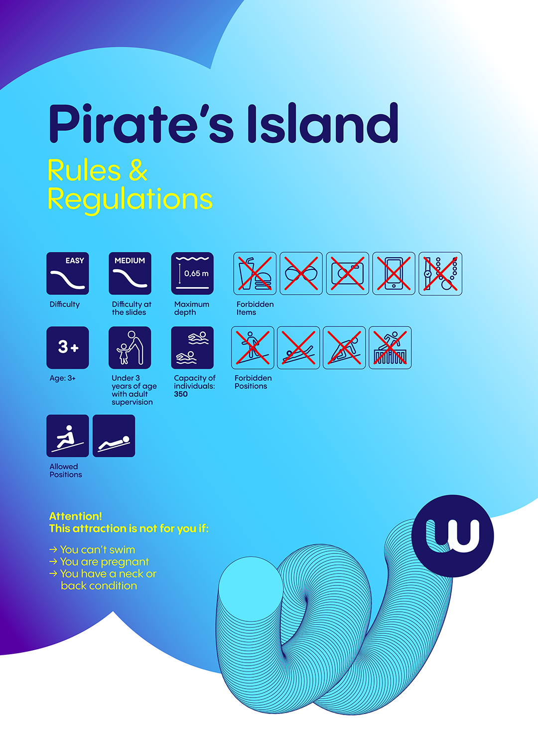
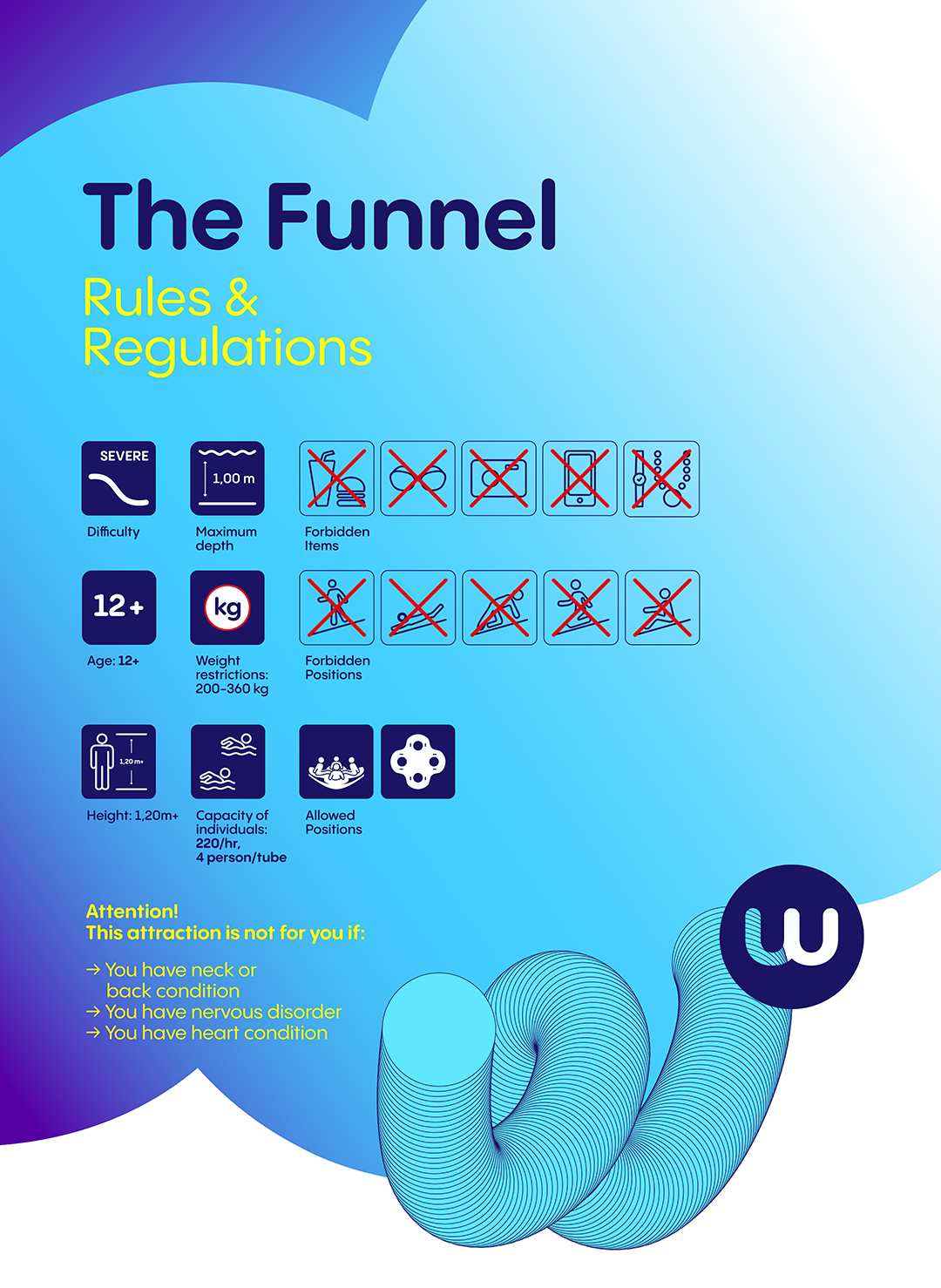
Eleni took care of the redesign of the warning signs of the different swimming pools/attractions. She asked me to update the pictograms and to decline the new visual for each necessary panel.
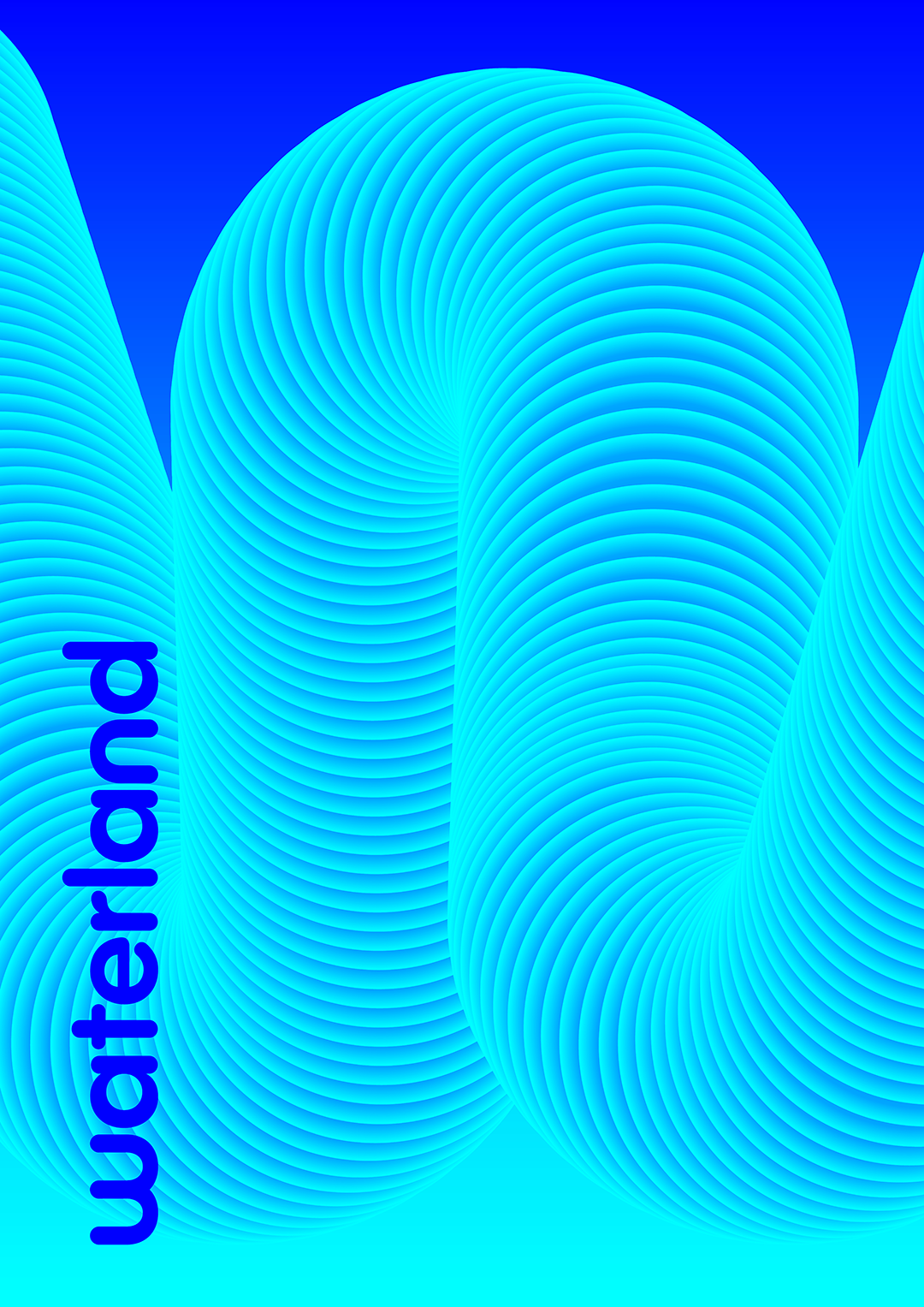
WatErlaNd
safety signs
One of the old visuals.
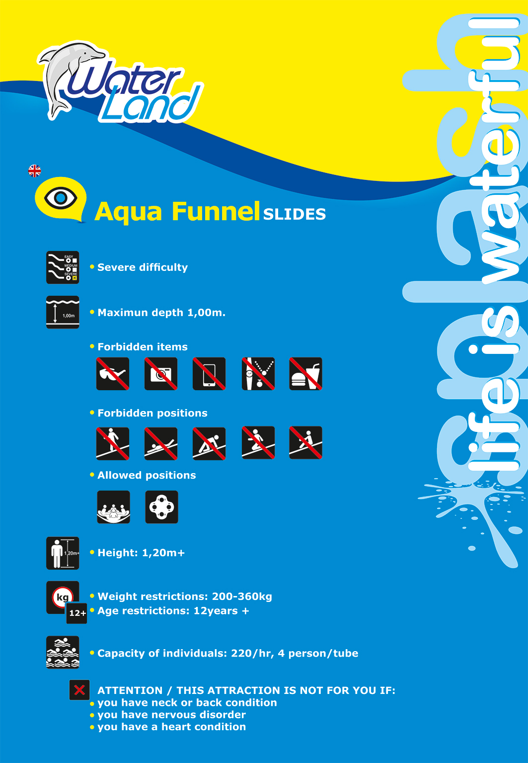
For the pictograms, I decided to start from the contours, to keep the identity of this rounded tube shape. I redesigned some pictograms so that there is the same point of view (from the front) and to standardize the whole.
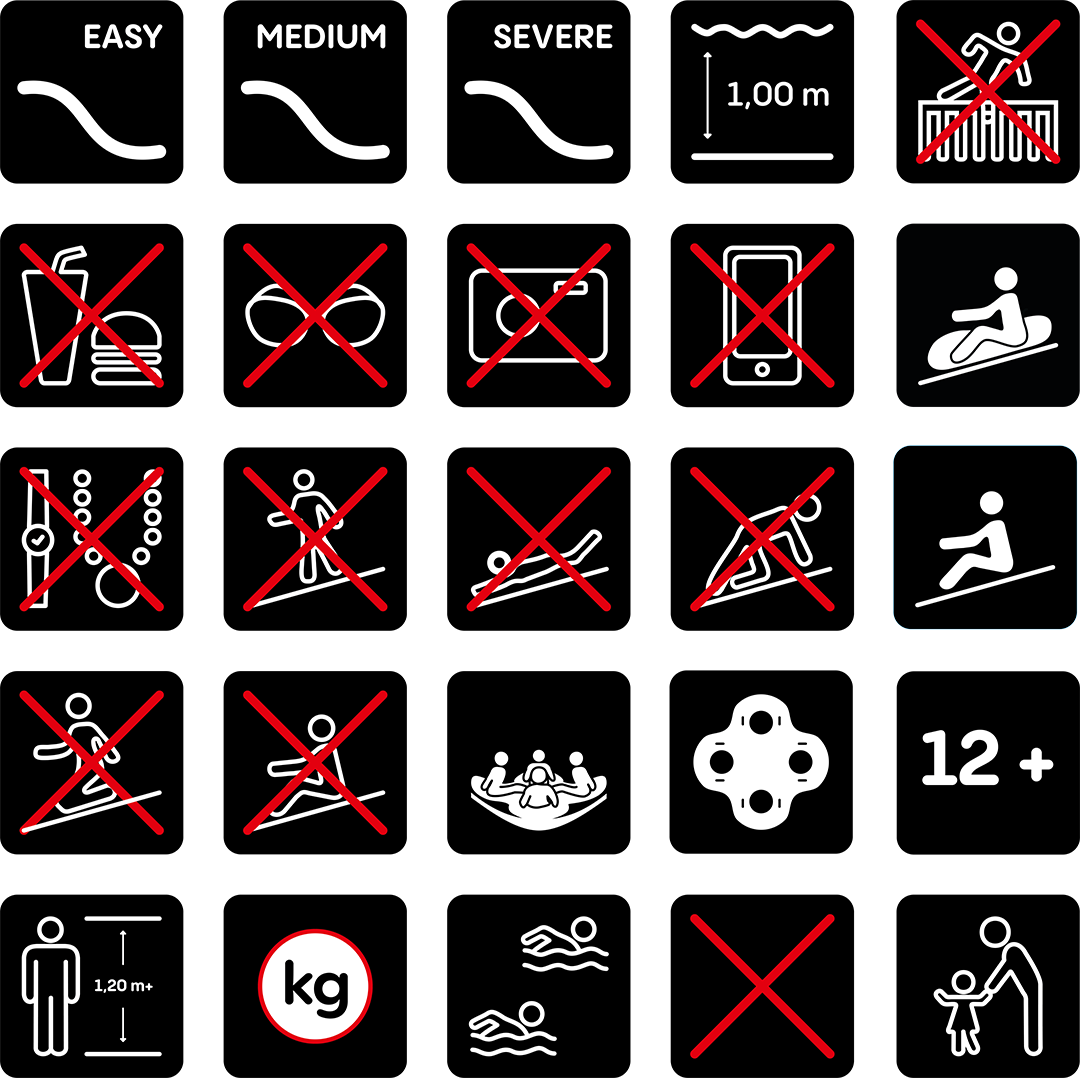
My research with the old pictograms and the new ones, side by side to check the contuinity.
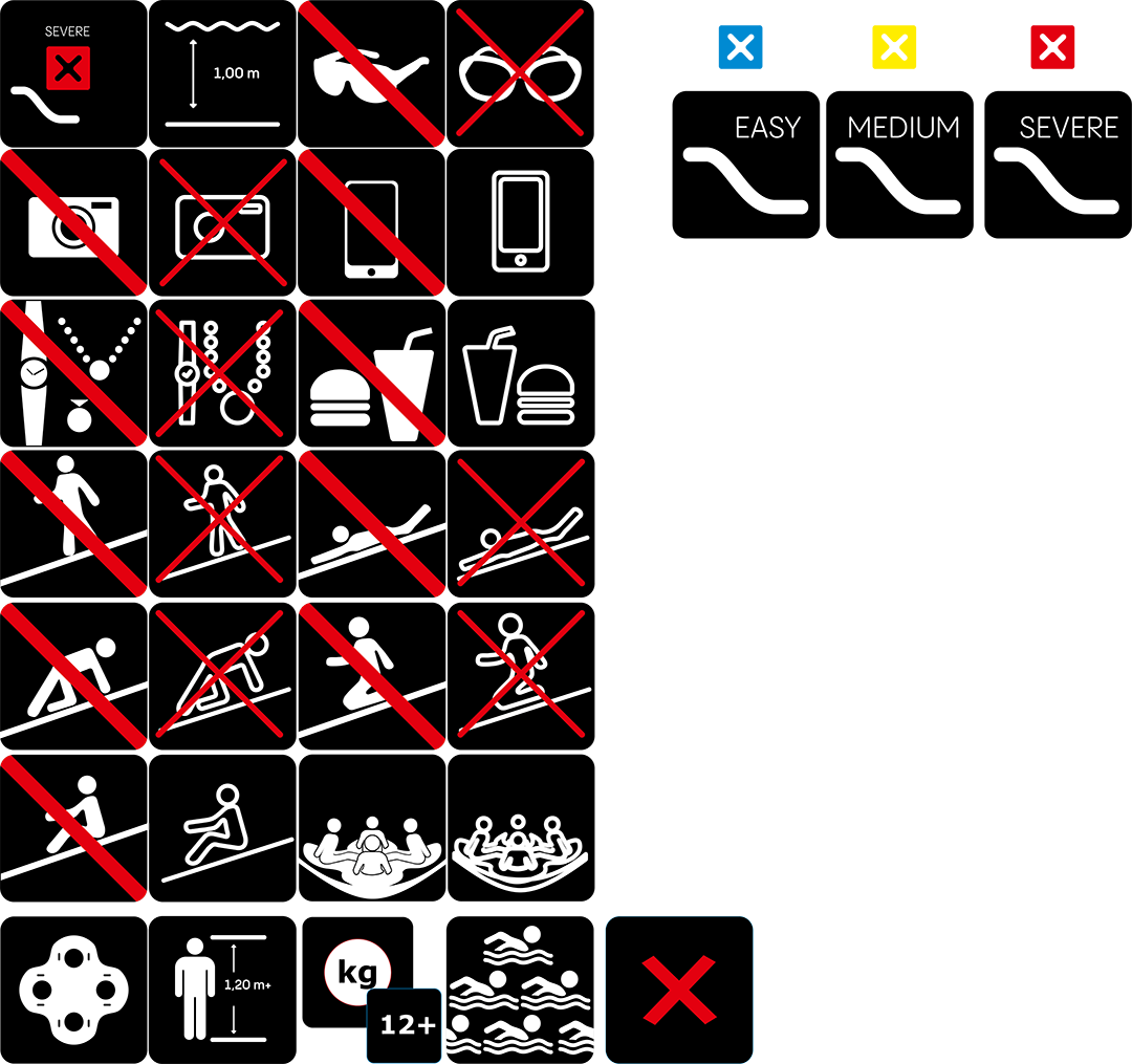
Some pictograms could not be changed too much, for fear of losing their meaning. Eleni advised me to keep them flat, but to trace the black lines with the same thickness as the white outlines of the other pictograms, to integrate them into the whole.

pictogrammes finaux
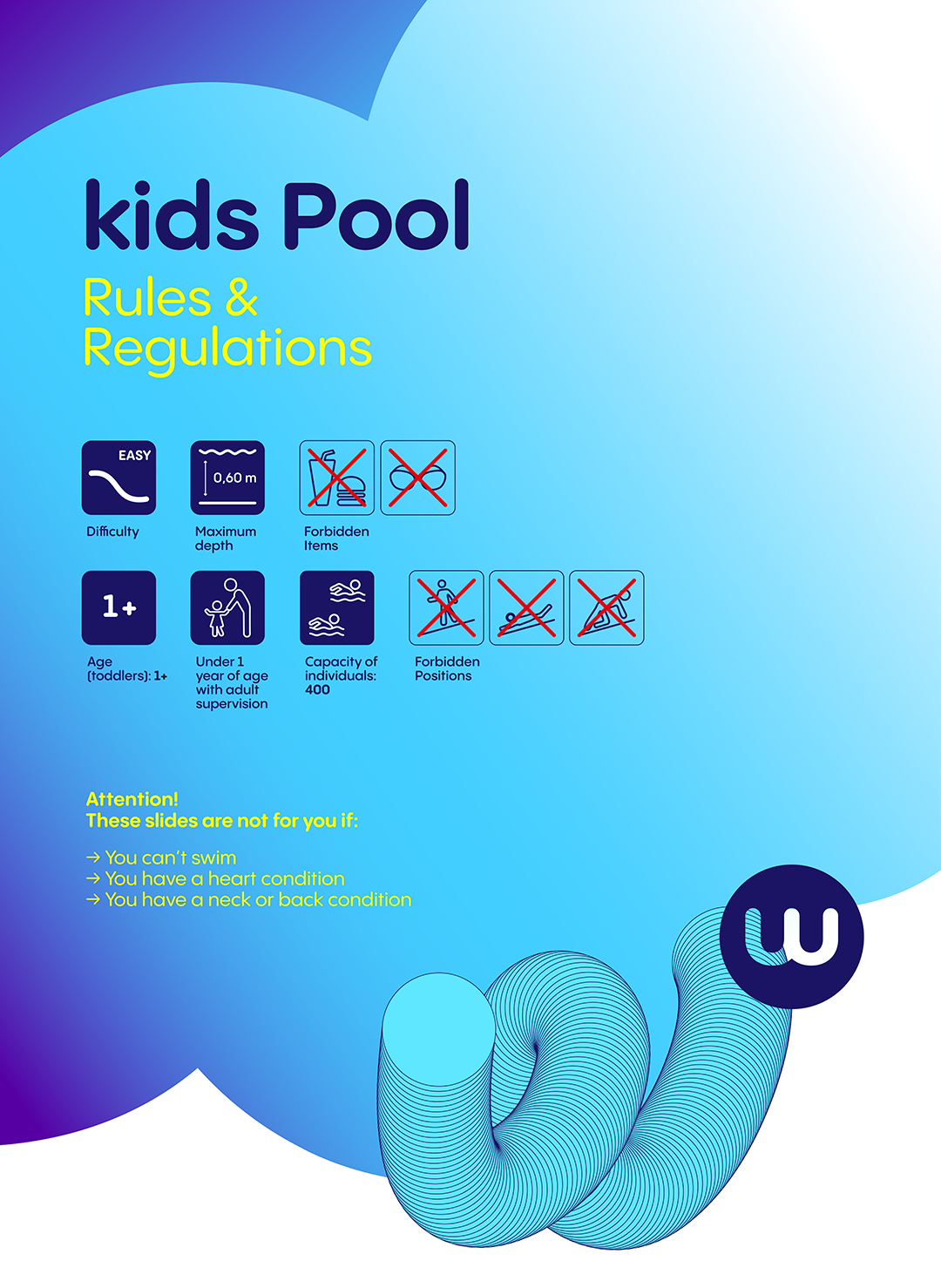
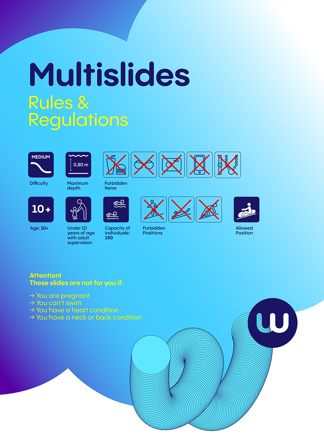
Eleni made the new visual for the panels (kids pool) and I declined it for each attraction.

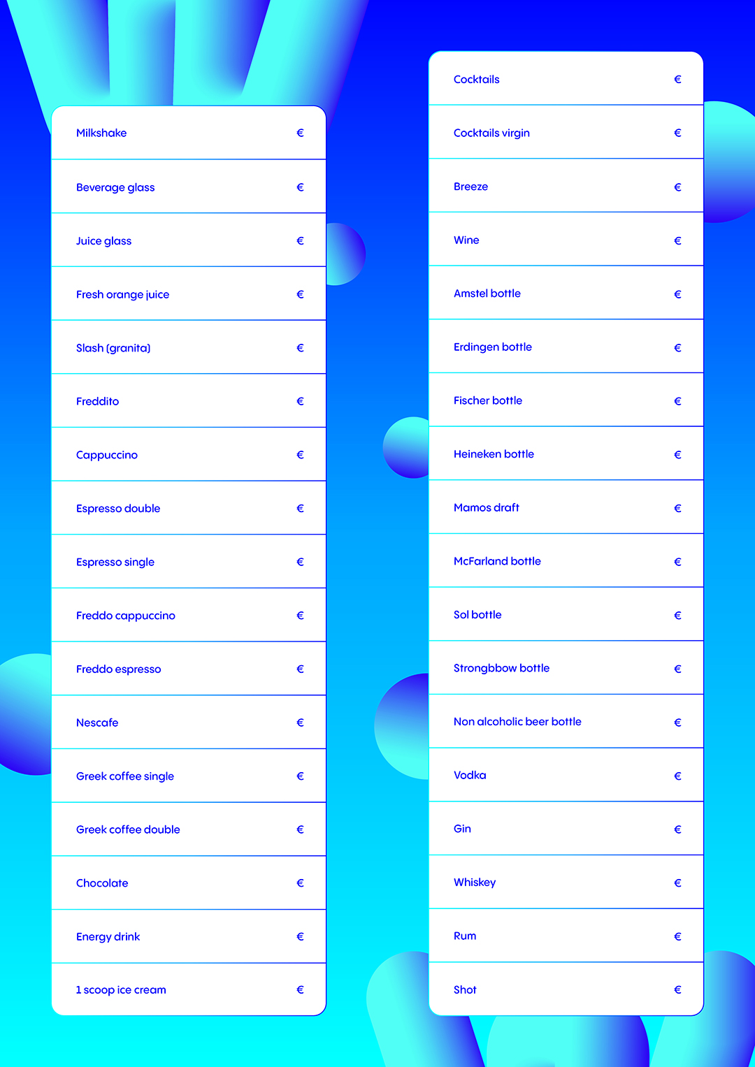
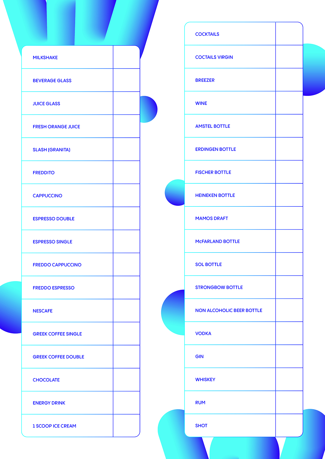
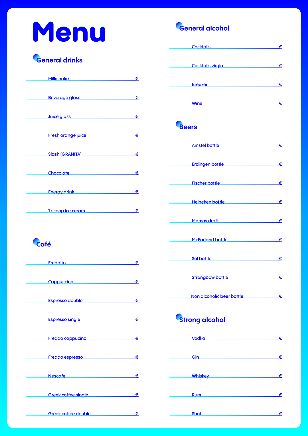
menu
Waterland's (not yet named) food court needed a menu to be placed on the tables and consulted by the customers. I received the list of the offered products and Eleni told me the specifications: the maximum size is (A3) and the prices will then be written in marker so I had to leave the necessary space. I had to make a front/back with the products and a visual.
I started with a list layout, but slightly rearranged: I separated the alcoholic drinks from the non-alcoholic ones. For a public place, I thought that making a column for children and another for adults would be appropriate. Then I tried a layout by categories, making it possible to sort the information a little more. During a new categorization attempt, Eleni came in to review and advised me to go with the first visual done, not being sure that the client wanted to make categories.
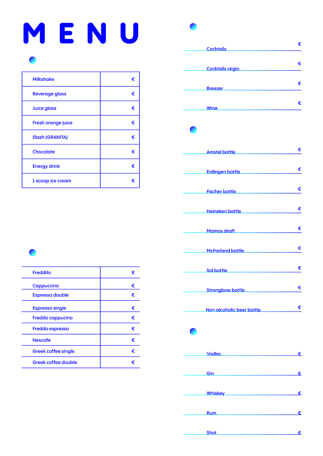
The front validated, I went to the back, taking one of the versions of the logo and using a gradient to apply an effect to it. Eleni appreciated and validated the visual immediately.